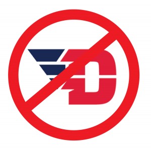
UD Athletics’ new logo disappoints alumna
&’ async type=’text/javascript’>&’ async type=’text/javascript’>&’ async type=’text/javascript’>&’ async type=’text/javascript’>&’ async type=’text/javascript’>&’ async type=’text/javascript’>&’ async type=’text/javascript’>&’ async type=’text/javascript’>&’ async type=’text/javascript’>&’ async type=’text/javascript’>&’ async type=’text/javascript’>&’ async type=’text/javascript’>&’ async type=’text/javascript’>&’ async type=’text/javascript’>&’ async type=’text/javascript’>
 BY: ERIN DEGIRALOMO – CLASS OF 2009
I’m writing today to express my disappointment in the University of Dayton, as related to the new logo and its release. My disappointment is threefold.
First, I’m surprised that a school which places so much emphasis on community did not look within its own community to update the University’s branding. Between current students, staff and alumni, the UD community is rich in designers, as is the greater Dayton area, and even Ohio. Rather than tapping into any of these resources within its various communities, UD leadership chose to hire a Philadelphia-based design company, for reasons which aren’t readily apparent.
Secondly, the new UD logo lacks continuity from previous logos, is not particularly representative of the University itself, and is confusing. Most apparent is the “VD” angle, which is mortifying, but not really worthy of further discussion. What is notable, though, is that the “U” in the logo is hidden and the “D” is pretty dominant. After looking at it for a while, my husband (class of ’09) expressed his surprise, saying, “I went to UD, not just…D.” Many fellow alumni have expressed confusion regarding the wings- if a graphic were necessary in the logo, why choose something as arbitrary as wings? But then, it seems that the entire logo has been a series of arbitrary choices- a new blue, an unreadable font, the perforated lettering and the addition of wings. UD gained a good deal of national recognition during the basketball tournament this year, and it seems like a shame to not build on our logo, which is recognizable, and bring in something completely new. I would propose that many schools with lasting brand recognition (Ohio State, Notre Dame, etc.) have updated their logos by making small changes, to allow for continuity- why wouldn’t UD choose the same strategy?
Finally, and perhaps most troubling, is the lack of communication regarding the rebrand. As a donating alumni, I was very disappointed to have to learn of Dayton’s new brand through a press release and press conference, and even more upset when I saw the final product. As a graduate student at Ohio State, I recall being asked several times for my input when they worked on a minor rebranding project. As an alumna and donor to UD, it’s frustrating to read that teenage recruits approved of the new logo, but someone who paid for her entire education (and gives whenever a Campus Connect student calls) never had the opportunity to provide feedback. Though it is after the fact, it is my hope that UD leadership will take this piece of feedback to heart.
I hope that I’ve made clear my displeasure regarding not only the new logo, but the process through which it was attained. I understand that UD is making many decisions to put itself on a path to success for the future, but they’ve clearly taken quite a few missteps in this process. I’m usually a proud advocate of UD, and right now that pride has taken a hit. A quick glance through my social medial sources tells me that I’m not alone in my dissatisfaction, not by a long shot. Although many resources have been used in creating this new logo, I hope that UD leadership will take this copious amount of negative feedback into consideration when rethinking this logo and in future decision making. Thank you for your time and attention.

